Views
Overview
Unified App builder that provides pre-built components to create simple, easy to use apps, as well as the freedom to create complex apps for developers.
In Views, there are verity of controls available. You can add controls to the views and design screens. Each controls have customisation properties to change their behaviour, look and feel.
Views we create here are like structure. Created views will be listed in Patchwork and we can use it for building logic. We can add same views multiple time as a different object.
Create New
For creating new View, user can click on New button on Right-Top corner. User need to provide below details for creating a view.
-
Name
-
View Type
-
View
-
List
-
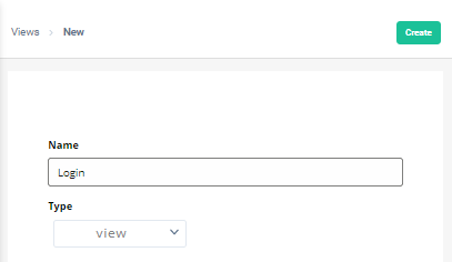
Once user press “Create” button- It will redirect to View builder screen. View builder contain all the tools required to build view.
List of Views
When user open this screen, all the views created in this app will be listed here. It will display View Name & Type. Type can be either Dataset or View.
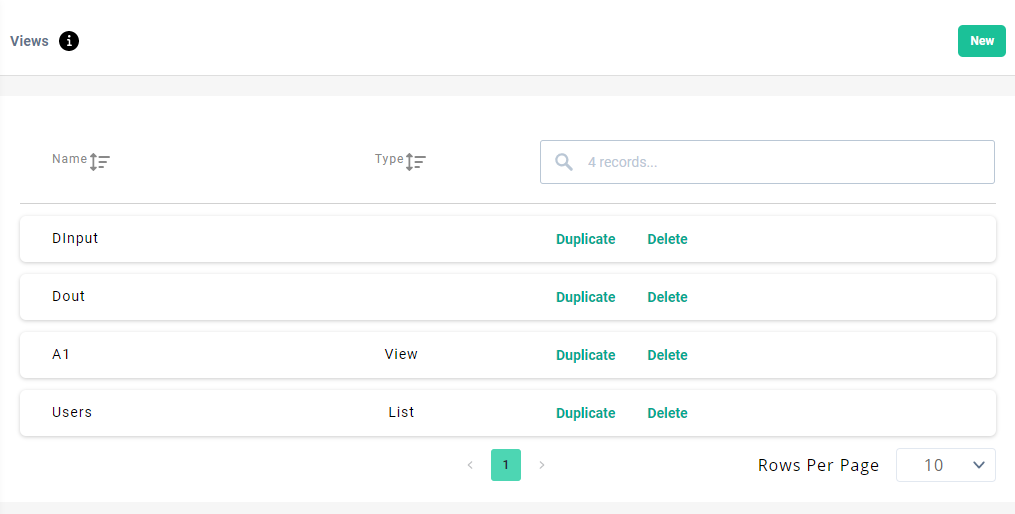
In list we have below actions available.
Sort |
Views listed in grid can be sort by Name or Type. |
Search |
Views can be search by Name and Type in the grid/list. |
Duplicate |
You can create new View same as existing one, using this option. When user clicks on duplicate for a View, it asks for
Once user click on Copy-button it create the copy of selected view into selected application with New name. |
Delete |
Delete selected view. |
Once user select a view from list - It will redirect to View builder screen. View builder contain all the tools required to build view.
View builder (Designer window)
This portion of the page enables the user to design the view, by adding Controls/Components to the view and setting available properties of the Components. You can set the properties of the Components and View to set the design of application.
Design Area
When we create a view, it will display in the design area. You can add components into the view to shape it as per requirement. You can drag and drop controls/components from the right side panel. You can customise the components by changing its properties and that will be visible in Design Area. It provides the visual of application view in development environment.
Add Component
We need controls while designing a View for the application. We have below list of components that can be use. By setting its properties, we can customise look and feel of Components and views.
Available Components in View Builder.
Dataset
Add existing dataset view to the application. You can add dataset view from any application he has access to.
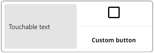
Custom button
Custom button can be used to make clickable text/button/image.
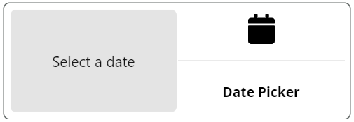
Date Picker
Input control for accepting date and time from the App user.
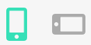
Icon
This control used for icon display in View.
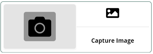
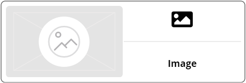
Image
Addimage to the View and customize it’s design by changing control properties.
Input
This control can be used for fetching text input from Application user.
Map
Control can display area/city map in Application.
PDF Viewer
This control can be used for displaying PDF file inside application.
Simple Text
Use to write simple text on the application. Like instruction, field heading or help text.
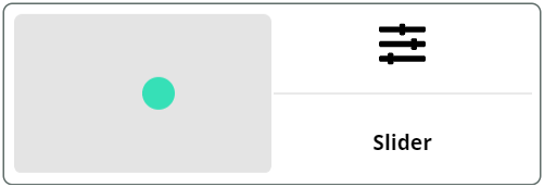
Slider
It can be used for selecting number between range. For example: brightness, volume, price, quantity.
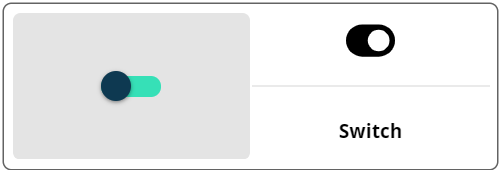
Switch
It is used for taking Boolean input from the application user. For turning On/Off feature using switch.
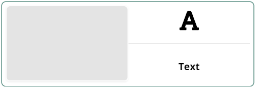
Text
App builder can add Rich text label in application. You can do specific formatting for different words.
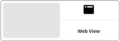
Web View
It’s a web browser control, It can display web-page in-application.
View Properties
It’s View’s property. Here, we can set the look and feel of the View. Below are the main properties and sub properties we can set to design view.
Padding
we can set the View padding from Top, Bottom, Left and Right respectively. It accepts the pixel values.
Background
Adjust back ground with colour or backgroundimage. There is more option available for designing background of a view.
-
Override - To set view specific background one need to check the Override checkbox. Then after other (Color,image &image size) options for setting view background will be enable.
-
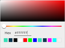
Color - You can choose the background color using color picker available. In the color picker user can either click on color or enter #code of color to select color.
-
Image - Animage can be choosing to set as a view background. User can select the backgroundimage from the Media section of the application. Ifimage is not present in the Media, we can add newimage and select for the background.
-
Image size - Here, we can configure howimage should cover the view’s background. It has below options for selection.
-
Cover
-
Contain
-
Stretch
-
Repeat
-
Center
-
Inputs
In some Views, we need to pass parameters for generating View.
For example, showing an employee information on a view, it needs Employee ID. Employee ID will be input for the employee detail View.
You can add input parameters.
By using ${name} syntax user can access input parameters withing views.
Outputs
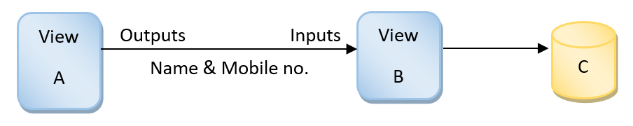
This defines the output parameters for the view. One View can pass values to another view using output parameters.
By using ${name} syntax user can access output parameters withing views.
For example, If View A takes user values like Name & Mobile number and pass to another View B that save it to Dataset C.
Component Properties
You can change look and feel of the Components by changing its properties in this Tab. Each component has different properties specific to its usage. It has below sections to find specific property:
-
Dimensions
In this section, we can set component’s positioning and size in pixel.
X-Space from the left.
Y-Space from the top.
W-Component width.
H-Component height.
Styling
Design of the component can be set under this section. List of properties can be different for different components. Like background color/image, border, alignment etc.
-
Override, it will override the basic inherited style from the View and user can customise it.
-
Component padding, Left, Top, Right & Bottom component padding.
-
Component container padding, Left, Top, Right & Bottom component container padding.