List View
Overview
List Views are patches that can show content in the form of a list. A list view patch can contain lists, galleries, maps, or other information. The list content is provided by other sources, usually a dataset.
Create a List View Patch
List views are created in the app editor Design tool.
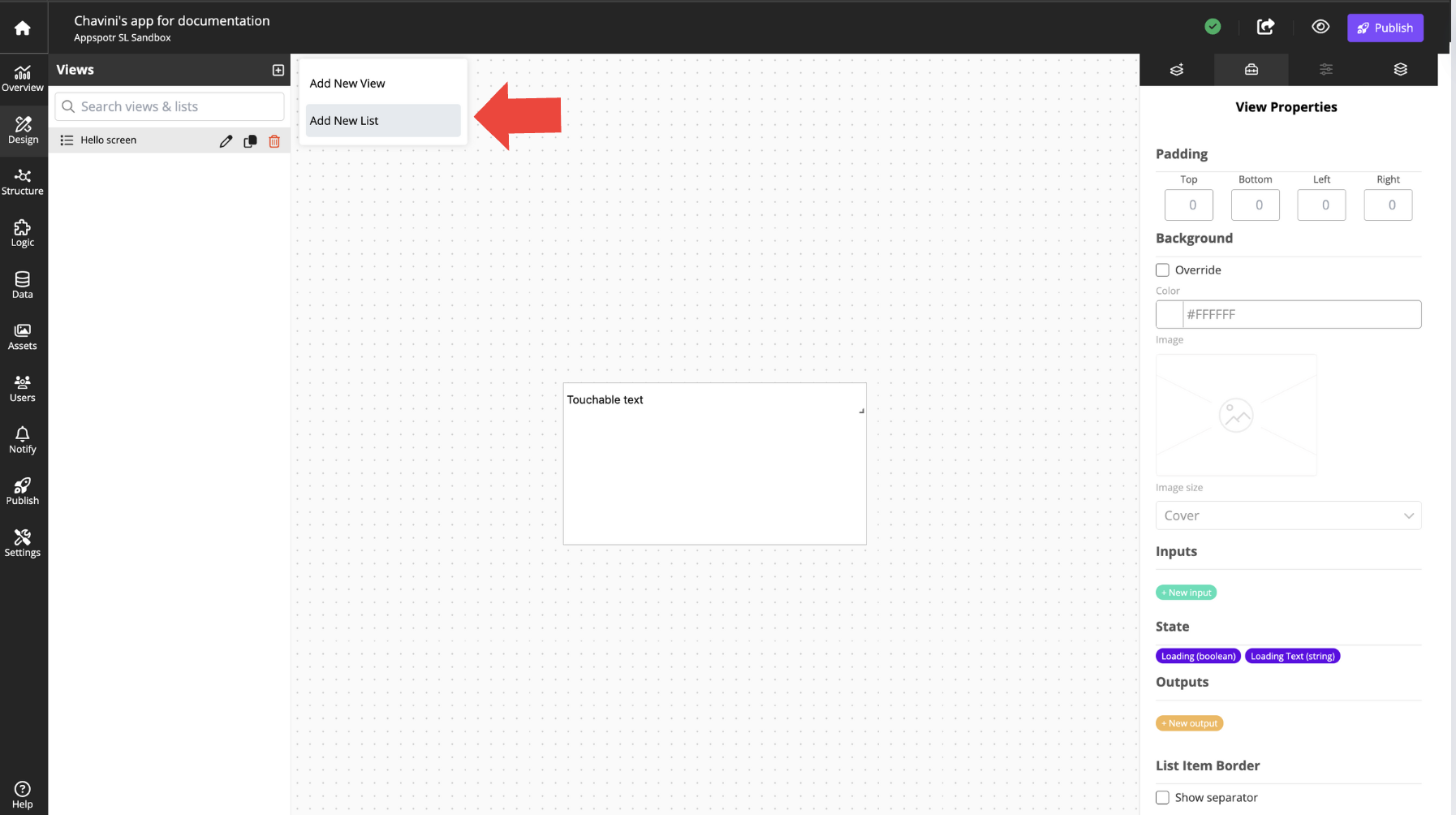
Navigate to Design tab and Click on Add New List
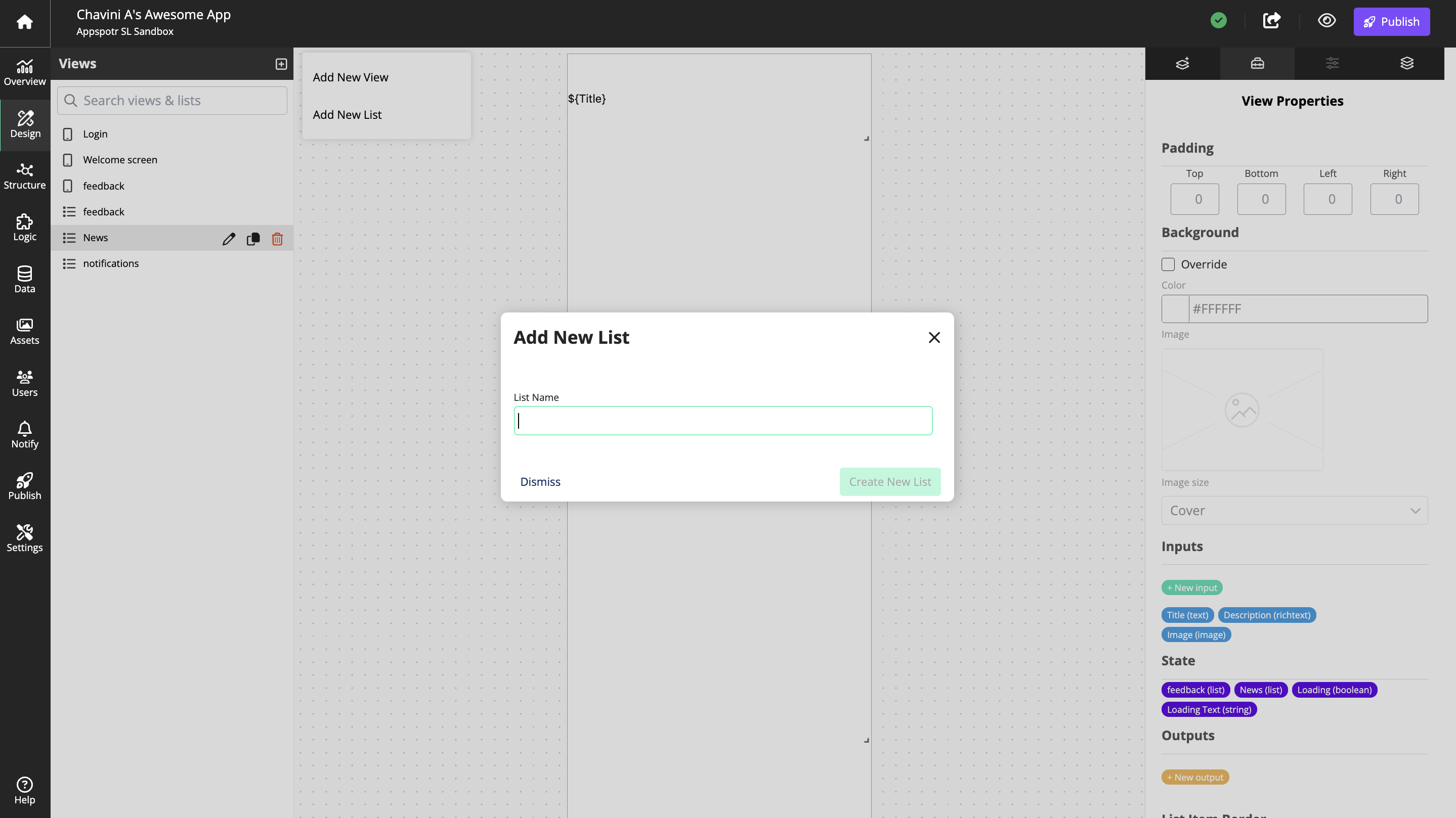
Provide a Name for the List View, and click on Create New List
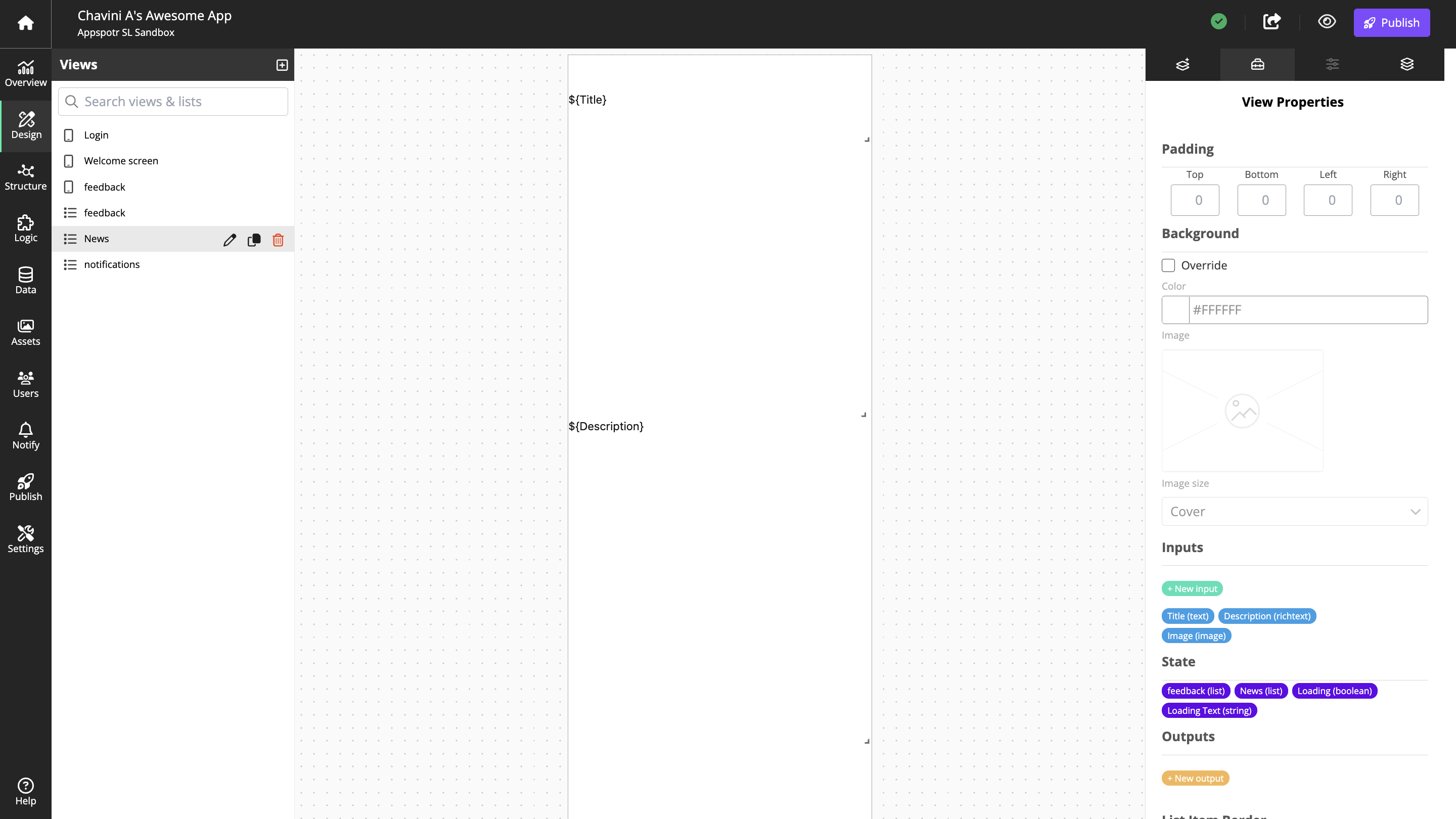
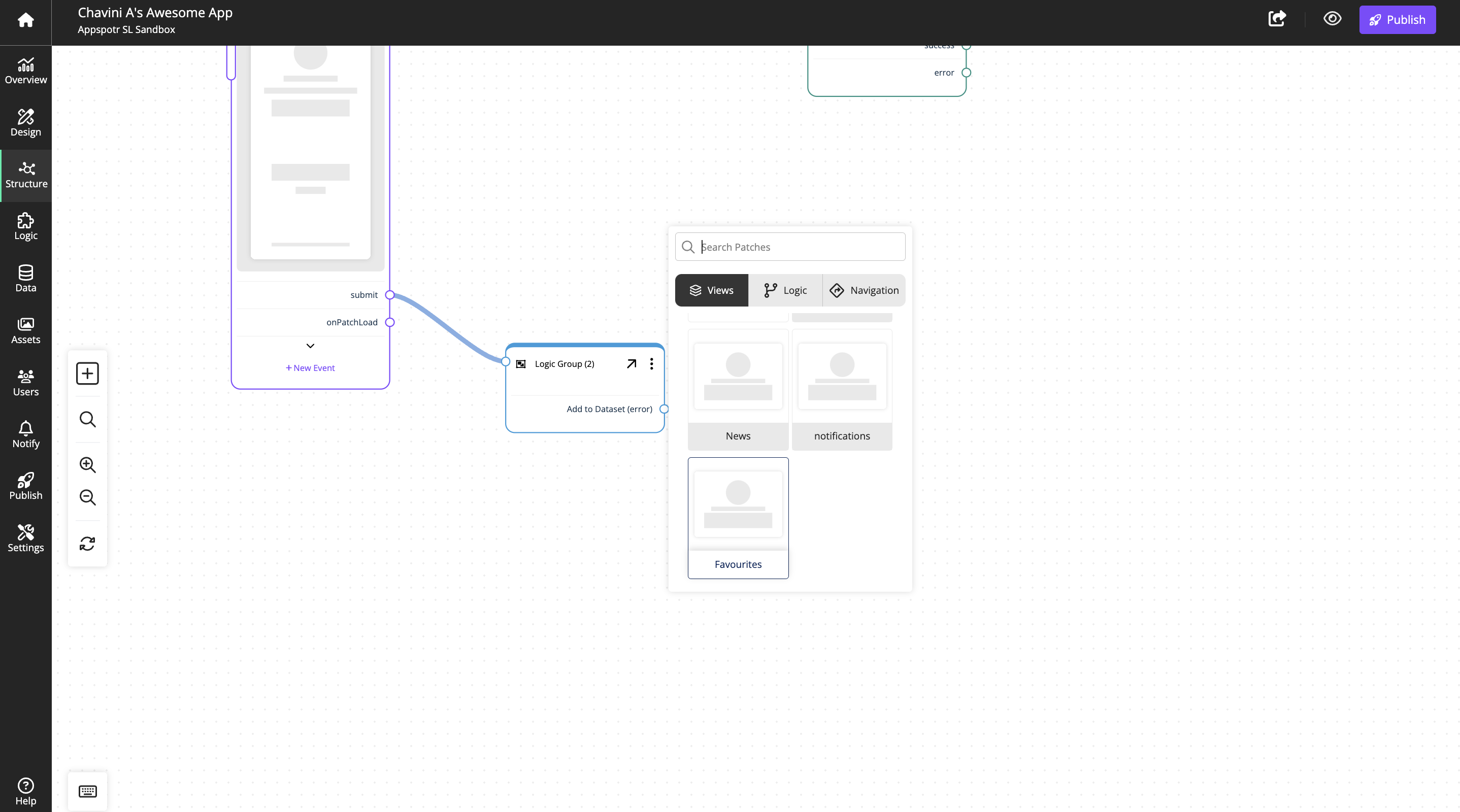
Now the new List View will be displayed under the List of Views and you can start configuring it according to your requirement.
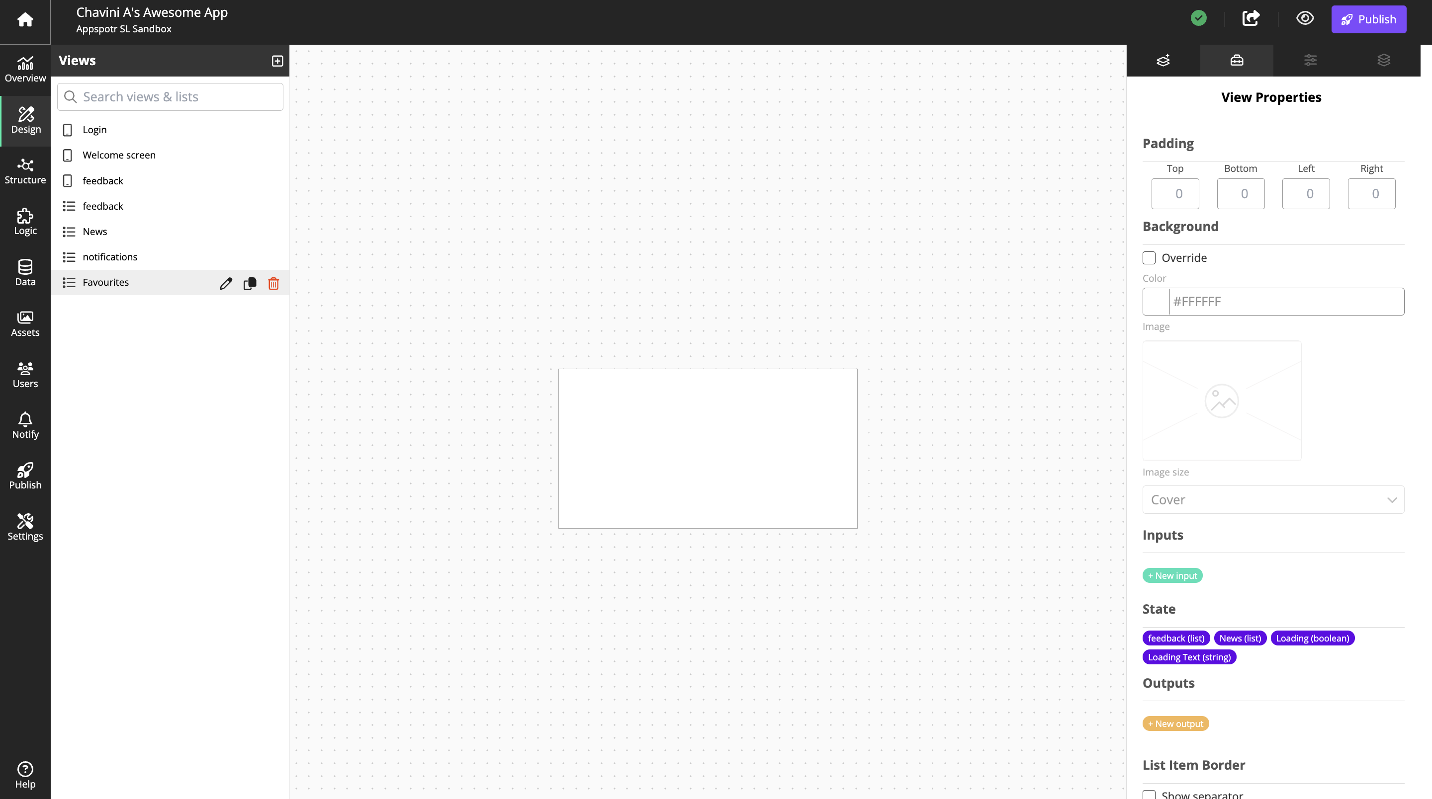
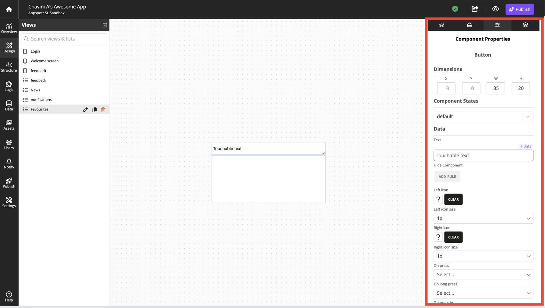
You can edit, Duplicate or delete the list view by clicking on the relevant button under List of Views.
Once created, they become available in Patchwork under Lists category.
Configure List View Patch
When selected in patchwork, the configuration dialog for the list view patch is shown on the right.
Name |
Identifier for the view in the CMS. |
The identifier should reflect content or function. |
|
Patch Name Accessibility Label |
Interface Accessibility label. |
||
Patch Name Accessibility Hint |
Interface Accessibility hint. |
||
Icon |
Select an icon to be associated with the patch on the app’s menus and in the Patchwork view. |
||
Top Bar Behavior |
Configure the behavior of the app’s top bar, when the user is on this patch. |
The behavior can be Inherited from the app’s menu, or set to Visible, Invisible or Hide on Scroll. |
|
Top Bar Type |
Sets the Top Bar Type to Title, Image or None. |
||
Top Bar alignment |
Sets the alignment, Center, Left or Right, of the top bar. |
||
Back Accessibility Label |
Interface Accessibility label. |
||
Back Accessibility Hint |
Interface Accessibility hint. |
||
Map Inputs To Outputs |
By mapping inputs to an outputs, data can be transferred directly through the view. |
||
Padding |
Adds padding to the Top, Bottom, Left and Right of the list view. |
||
Background |
Add Color or an Image to the background. This overrides the settings made when designing the list view. Select if the image should be centered, repeated, stretched, and so on. |
||
Type |
The data type, List, Calendar, Gallery or Map to be shown in the list view. |
||
List Source |
Select the dataset to be shown in the list view. |
||
Filter Items |
Filter the items in the list. |
||
Alternate Views |
Create alternate presentation of the list based on the content. |
||
On End Reached Threshold(0-1) |
Set a value between 0 and 1 to define at what distance the end is reached, when loading the list. |
||
Group By |
Select a column to group by. |
||
Order By |
Select a column to order by, according to ordering. |
||
Ordering |
Choose |
||
Featured |
Used to highlight an item or entry. |
||
Sortable |
Make the list sortable. Name the different sorting options. |
||
Sort Menu Accessibility Label |
Interface Accessibility label. |
||
Sort Menu Accessibility Hint |
Interface Accessibility hint. |
||
Menu Item Label |
Label for the menu item. |
||
Menu Item Accessibility Label |
Interface Accessibility label. |
||
Menu Item Accessibility Hint |
Interface Accessibility hint. |
||
Ascending Label |
Label of the ascending sort option. |
||
Ascending Accessibility Label |
Interface Accessibility label. |
||
Ascending Accessibility Hint |
Interface Accessibility hint. |
||
Descending Label |
Label of the descending sort option. |
||
Descending Accessibility Label |
Interface Accessibility label. |
||
Descending Accessibility Hint |
Interface Accessibility hint. |
||
Column Selection Placeholder |
Select a placeholder column. |
||
Column Selection Accessibility Label |
Interface Accessibility label. |
||
Column Selection Accessibility Hint |
Interface Accessibility hint |
||
Searchable |
Add a search box to find items in the list. |
||
Search Accessibility Label |
Interface Accessibility label. |
||
Search Accessibility Hint |
Interface Accessibility hint. |
||
Loading Property |
Select if a spinner should show while loading a dataset from an external source. |
||
Empty List or Dataset |
Configures behavior if the list is empty. |
||
Icon |
Select an icon for the empty list. |
||
Icon Color |
Select the icon’s color. |
||
Text |
Set a text to be shown. |
||
Text Size |
Set text size. |
||
Inputs |
Connections coming in to this patch. |
||
Outputs |
Connections going out from this patch. |
||