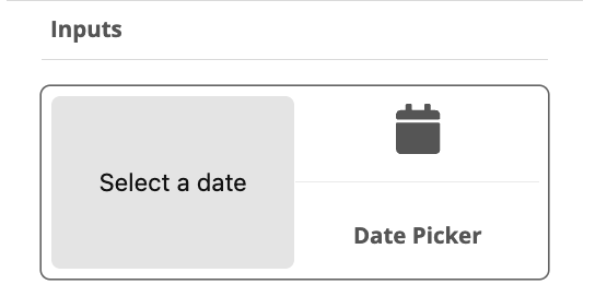
Date picker
Overview
Add a Date Picker to the view.

Component Properties
Dimensions — The placement on the canvas (X and Y) and the size (width and height) of the component.
| To move a component freely, the View Property tab must have the Free Positioning option checked. |
Data
Label — Set a text to be shown as the date pickers label.
Default Value — The date picker’s default date and time.
Input Value — Select a value from an input, configured under the View Properties tab.
On Change — Select event when the value is changed.
On Focus — Select event when the date picker gets focus.
On Blur — Select event when the date picker loses focus
Hide Component — The date picker can be hidden by applying a rule on a certain event.
Output
Value — Select a value to be sent to output, configured under the View Properties tab.
Accessibility
Accessibility Label — Interface Accessibility label.
Accessibility Hint — Interface Accessibility hint.
Accessibility Role — Select an accessibility role, a function, for the component, to support disabled users.
Styling
Override — Override the currently selected style.
Text Color — Select the color of the component’s label text.
Text Font — Select the font of the date component’s label text.
Text Size — Select the font size of the component’s label text.
Text Style — Select the font style, normal or italic, of the component’s label text.
Text Weight — Select normal or bold text.
Text Align — Sets the alignment of the text, left, center or right.
Text Decoration — Adds underline or strike through decoration to the text.
Letter Spacing — Sets the space between letters.
Text Transform — Select if the text should be set to uppercase, lowercase or begin with a capital letter.
Border Color — Select the color of the component’s borders.
Border Style — Sets the style, solid, dotted or dashed, of the component’s border.
Border Width — Sets the width of the component’s border.
Background Color — Sets the background color of the component.
Background Image — Select an image as the component’s background.
Background Size — Select if the image should cover the component’s background, be centered, repeated or stretched.
Component Width — The width of the component inside the container (the component’s borders).
Component Height — The height of the component inside the container (the component’s borders)
Flex Direction — Select the main axis where flex items will be placed, for instance horizontal or vertical (along a row or in a column).
Justify Content — Select how flex items will be placed in relation to each other, for instance towards the start of the flex direction, or with space between.
Align Content — Select how flex items will be placed in relation to the components border.
Align Items — Select how flex items will be placed in relation to the flex direction.
Border Top Color — The color of the component’s top border.
Border Top Width — The width of the component’s top border.
Border Bottom Color — The color of the component’s bottom border.
Border Bottom Width — The width of the component’s bottom border.
Border Left Color — The color of the component’s left border.
Border Left Width — The width of the component’s left border.
Border Right Color — The color of the component’s right border.
Border Right Width The width of the component’s right border.
Border Top Left Radius — Sets the rounding of the top left corner.
Border Bottom Left Radius — Sets the rounding of the bottom left corner.
Border Top Right Radius — Sets the rounding of the top right corner.
Border Bottom Right Radius — Sets the rounding of the bottom right corner.
Border Radius (All) — Sets the rounding of all corners.
Border Style — Sets the style, solid, dotted or dashed, of the component’s border.
Shadow — Adds a shadow to the component’s borders.
Opacity — Sets the opacity of the component.
Component Padding — Sets the padding, top, bottom, left, right of the component inside the container (the component’s borders).
Component Container Padding — Sets the padding, top, bottom, left, right of the component container (the component’s borders).