Component properties
Overview
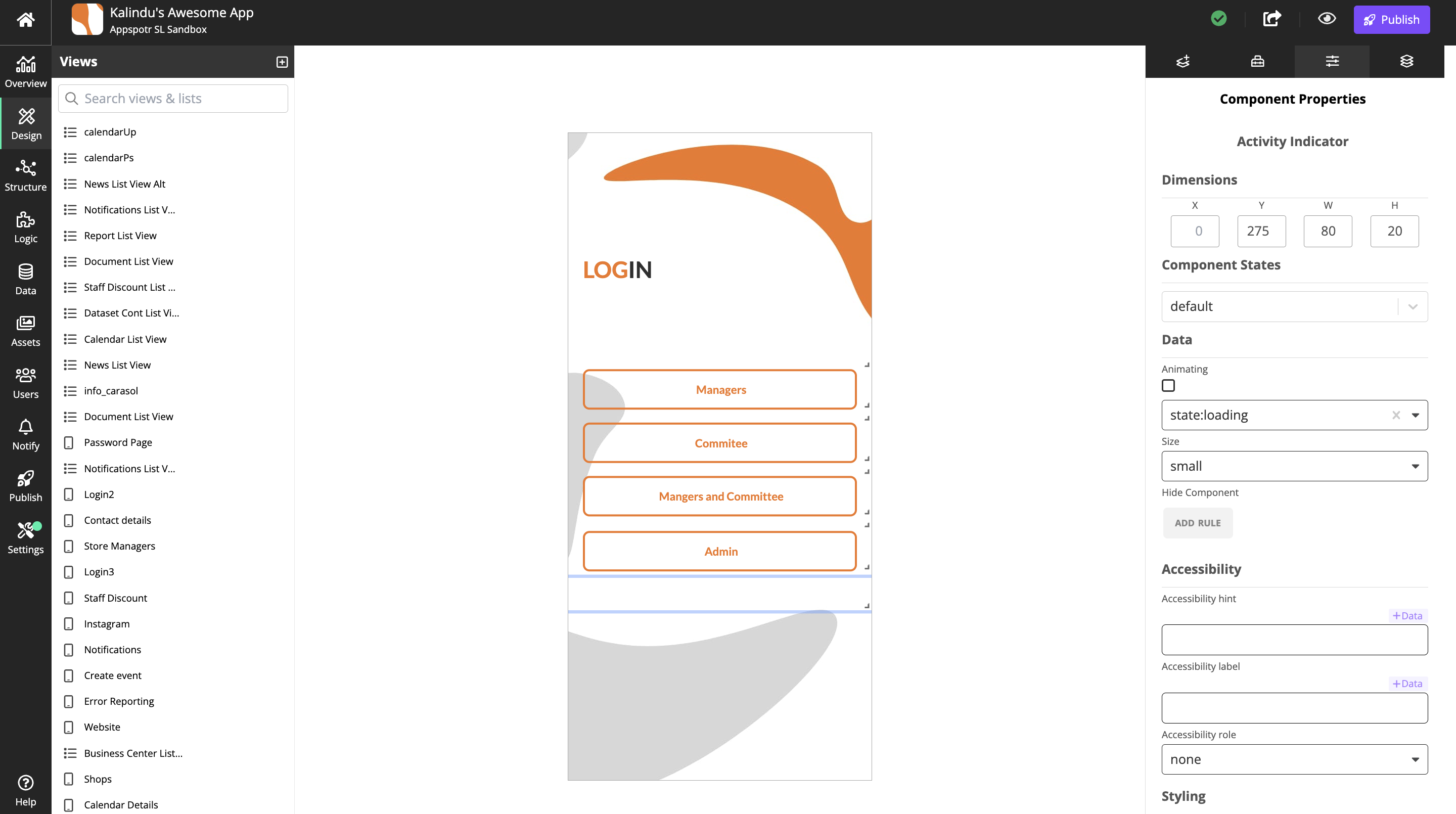
In Design builder, the Component Properties tab allows you to configure and customize individual components within your app.
Here’s what you can typically do with it:
Adjust Visual Properties: Change the appearance of a component, such as size, color, margins, padding, fonts, and visibility.
Manage Component Behavior: Set interactions or triggers, like onClick actions, hover effects, or transitions when a user interacts with the component.
Modify Layout Settings: Control the positioning of the component within the app, adjusting alignment, floating, and layering.
Add or Edit Content: Change text, images, or media within the component to match the app’s functionality and design.