Components and Properties
Overview
The part for creating the app’s user interface, with components such as buttons, lists, sliders, texts, images and so on.
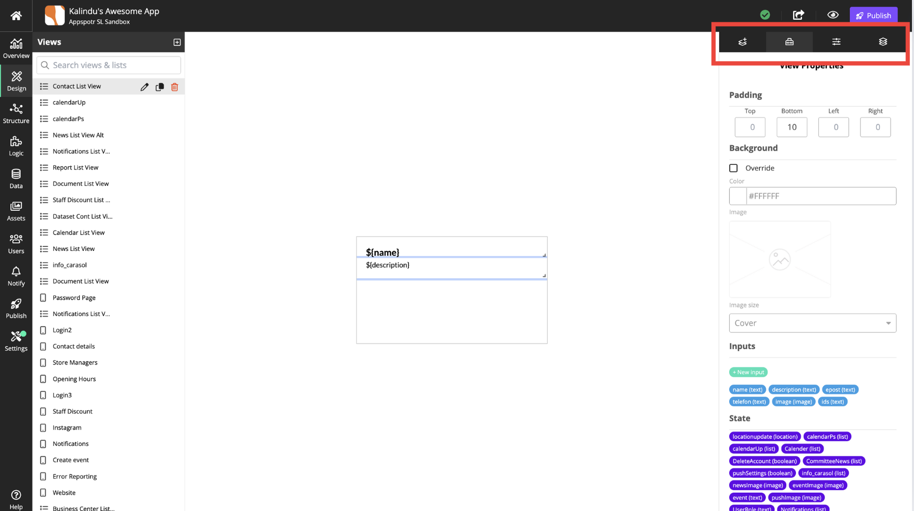
The area on the right consists of four tabs:
The area on the right consists of four tabs:
Add Component — Library of component that can be added to he view — buttons, sliders, maps, images and lists.
View Properties - The selected view’s properties.
Component Properties - The properties for the selected component.
ayout Properties - Additional layout options for the view.