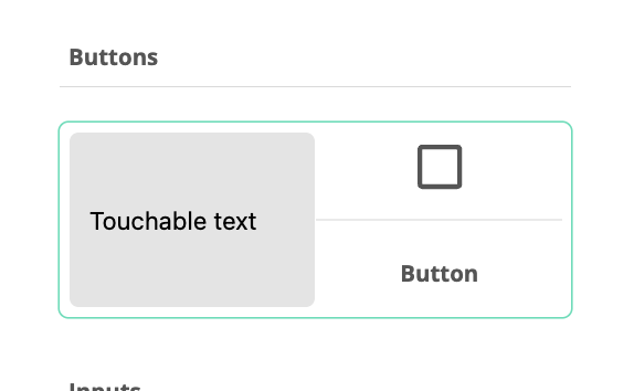
Button
Overview
Add buttons, with optional text and/or icons.

Component Properties
Dimensions — The placement on the canvas (X and Y) and the size (width and height) of the component.
| To move a component freely, the View Property tab must have the Free Positioning option checked. |
Data
Text — The optional text on the button.
Hide Component — The component can be hidden by applying a rule on a certain event.
Left Icon — Select an optional icon. If the button only doesn’t contain text and only one icon, the icon will be center aligned.
Left Icon Size — Select the left icon’s size.
Right Icon — Select an optional icon. If the button only doesn’t contain text and only one icon, the icon will be center aligned.
Right Icon Size — Select the right icon’s size.
On Press — Select event when the component is pressed, short.
On Long Press — Select event when the component is pressed, long.
On Press In — Select event when the component is pressed in.
On Press Out — Select event when the component is released.
On Focus — Select event when the component gets focus.
On Blur — Select event when the component loses focus
State
Disabled Condition — Select a state used to disable the button.
Accessibility
Accessibility Label — Interface Accessibility label.
Accessibility Hint — Interface Accessibility hint.
Accessibility Role — Select an accessibility role, a function, for the button, to support disabled users.
Styling
Override — Override the currently selected style.
Text Color — Select the color of the component’s text.
Font Family — Select the font of the component’s text.
Font Size — Select the font size of the component’s text.
Font Weight — Select normal or bold text.
Left Icon Color — Select the color of the component’s left icon.
Right Icon Color — Select the color of the component’s right icon.
Text Align — Set the alignment of the text, left, center or right.
Text Margin — Sets the text’s margin.
Background Color — The component’s background color.
Background Image — Select an image as the component’s background.
Background Size — Select if the image should cover the component’s background, be centered, repeated or stretched.
Component Width — The width of the component inside the container (the component’s borders).
Component Height — The height of the component inside the container (the component’s borders)
Flex Direction — Select the main axis where flex items will be placed, for instance horizontal or vertical (along a row or in a column).
Justify Content — Select how flex items will be placed in relation to each other, for instance towards the start of the flex direction, or with space between.
Align Content — Select how flex items will be placed in relation to the components border.
Align Items Select how flex items will be placed in relation to the flex direction.
Border Top Color — The color of the component’s top border.
Border Top Width — The width of the component’s top border.
Border Bottom Color — The color of the component’s bottom border.
Border Bottom Width — The width of the component’s bottom border.
Border Left Color — The color of the component’s left border.
Border Left Width — The width of the component’s left border.
Border Right Color — The color of the component’s right border.
Border Right Width The width of the component’s right border.
Border Top Left Radius — Sets the rounding of the top left corner.
Border Bottom Left Radius — Sets the rounding of the bottom left corner.
Border Top Right Radius — Sets the rounding of the top right corner.
Border Bottom Right Radius — Sets the rounding of the bottom right corner.
Border Radius (All) — Sets the rounding of all corners.
Border Style — Sets the style, solid, dotted or dashed, of the component’s border.
Shadow — Adds a shadow to the component’s borders.
Opacity — Sets the opacity of the component.
Component Padding — Sets the padding, top, bottom, left, right of the component inside the container (the component’s borders).
Component Container Padding — Sets the padding, top, bottom, left, right of the component container (the component’s borders).