App View Builder
Overview
The main view for creating the app’s user interface, with components such as buttons, lists, sliders, texts, images and so on.
The components added through Component lists will be displayed follwoing there properties
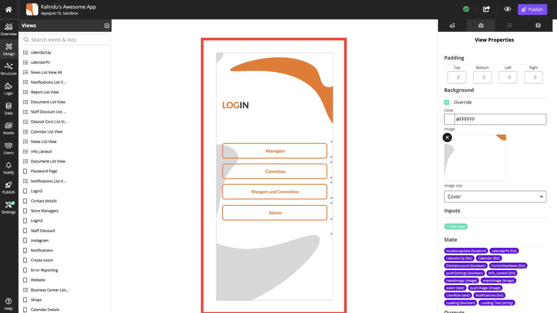
You can nagivate through the views and their components by checking on the tabs in right and left.