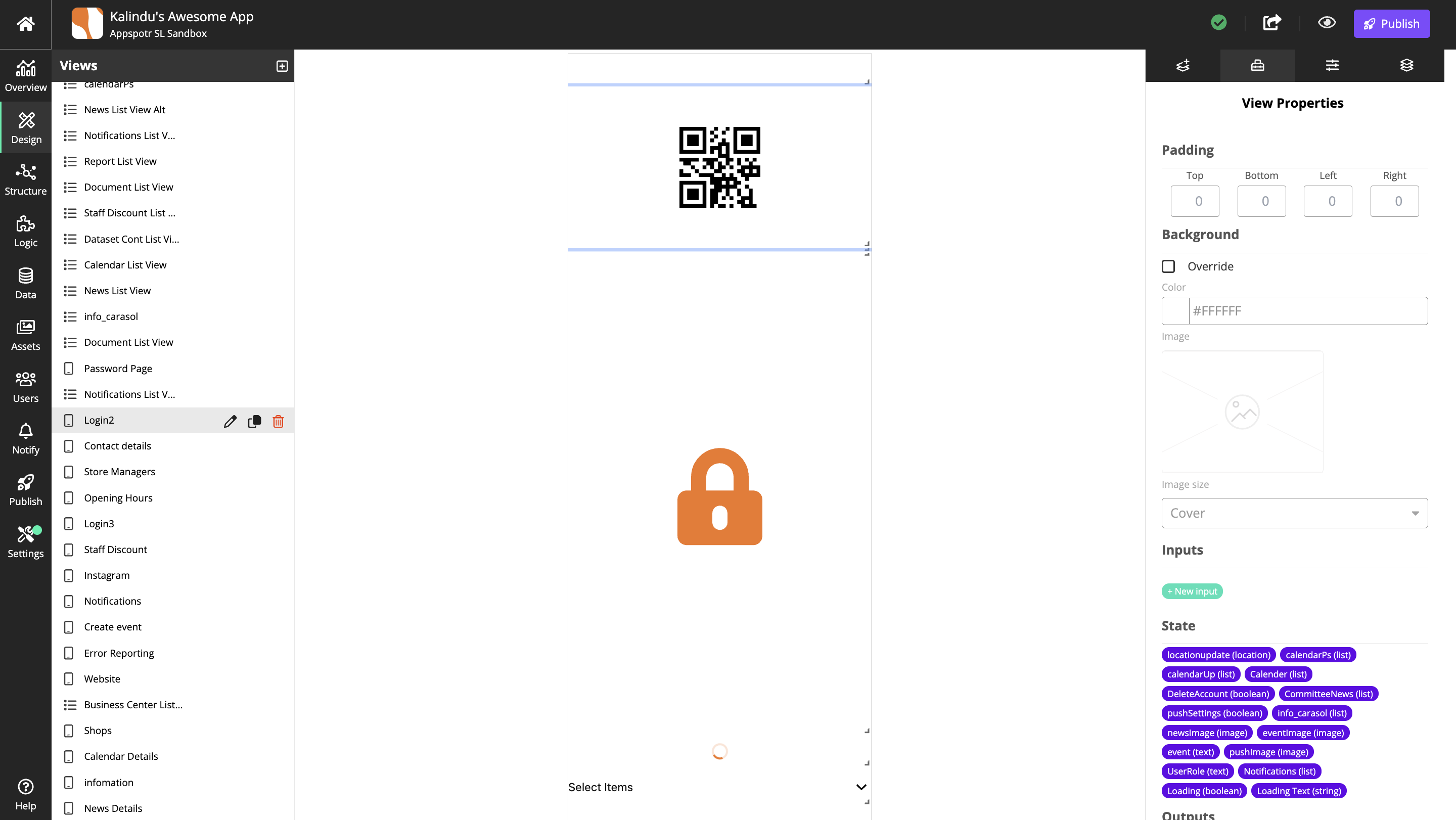
View Properties
Overview
The view properties lets you configure in detail how the view should look and behave.

Name |
Identifier used in the CMS. |
The identifier should reflect content or function. |
|
Padding |
Sets the inside padding (distance to borders). |
Unit is pixels. |
|
Top |
|||
Botton |
|||
Left |
|||
Right |
|||
Background |
Display settings for the view background. |
||
Override |
Override the currently selected style. |
||
Color |
Opens a color picker for the background color. |
||
Image |
Lets you select image to display in the background. |
The image must exist in the Assets library. |
|
Image size |
How to scale or stretch the image. |
For more information about the options, see image size. |
|
Inputs |
Create and configure inputs for use in the list views components. |
The inputs are used in the patchwork when connecting patches. |
|
States |
Available States. |
||
Outputs |
Create and configure outputs for use in the list views components. |
The outputs are used in the patchwork when connecting patches. |
|
Calendar Layout |
|||
Type |
Select the type of calendar. |
||
Start Date |
Select a start date. |
||
End Date |
Select an end date. |
||
Map Layout |
|||
Location |
Enter a place, for instance a city or country, as the map’s starting location. |
||
Center Coordinate and Zoom |
Enter a place, for instance a city or country, or coordinates as the starting map’s location. |
Zoom with the scroll wheel on your mouse or with |
|
View Layout Mode |
|||
Proportional positioning |
Center the components on the screen regardless of screen size. |
Requires Free Positioning. |
|
Free positioning |
Allow components to move freely on the canvas. |
||
Layout Options |
|||
Enable Landscape Layout |
Enable landscape mode of the view. |
||
Row Options |
|||
Show Separator |
Show a separator between rows. |
||
Color |
Display color for row separators. |
||
List Grouping Headers |
|||
Override |
Override the currently selected style. |
||
Background Color |
Sets the background color of the component. |
||
Font Color |
Select the color of the component’s text. |
||
Font Family |
Select the font of the component’s text. |
||
Font Weight |
Select normal or bold text. |
||
Font Size |
Select the font size of the component’s text |
||
Font Style |
Select normal or italic text. |
||
Text Decoration |
Adds underline or strike through decoration to the text. |
||
Text Transform |
Select if the text should be set to uppercase, lowercase or begin with a capital letter. |
||
Text Shadow Color |
Sets the shadow color of the text. |
||
Text Shadow Radius |
Sets the rounding of the text’s shadow. |
||
Letter Spacing |
Sets the space between letters |
||
Number of Lines |
The number of lines in a list. |
||
Ellipsize Mode |
Select how to handle ellipsis if, for instance a list doesn’t fit the container. |
||
Flex Direction |
Select the main axis where flex items will be placed, for instance horizontal or vertical (along a row or in a column). |
||
Justify Content |
Select how flex items will be placed in relation to each other, for instance towards the start of the flex direction, or with space between. |
||
Align Items |
Select how flex items will be placed in relation to the flex direction. |
||
Padding Top |
Sets the top padding of the component. |
||
Padding Right |
Sets the right padding of the component. |
||
Padding Bottom |
Sets the bottom padding of the component. |
||
Padding Left |
Sets the left padding of the component. |
||
Border Top Color |
The color of the component’s top border. |
||
Border Top Width |
The width of the component’s top border. |
||
Border Right Color |
The color of the component’s right border. |
||
Border Right Width |
The width of the component’s right border |
||
Border Bottom Color |
The color of the component’s bottom border. |
||
Border Bottom Width |
The width of the component’s bottom border. |
||
Border Left Color |
The color of the component’s left border. |
||
Border Left Width |
The width of the component’s left border. |
||
Border Style |
Sets the style, solid, dotted or dashed, of the component’s border. |
|
|
Border Radius |
Rounding of the corners. |
Unit is pixels. |
|
Top |
|||
Botton |
|||
Left |
|||
Right |
|||