Style
Overview
It is centralising place from where you can change the look and feel of all of your Views. You can configure multiple styles for the Application. Look and feel of the whole application can be changed easily by changing the applied style to application.
List of selected style
It displays currently selected style for the application. When we select the Style to apply on application from the available style, it will display in this Grid.
List of Available styles
All Styles created for this application get listed here. We have options to select, change or delete any of the Style.
Select
Each row has a function to Select the style as a current style. It will set the selected style for current application. Look and Feel configure in that style will be applied to all the views of the application.
Create new style * *
We can create new style by clicking on “New” – button on right-top corner.
We can add New Style Name & Description to create new style. Once Style is created in system, it will get open in Style builder.
Style builder/Editor
When we create a new style or open a Style from Available style, that style configuration will open in this section. It will provide facility to configure look & feel of different parts and actions of application.
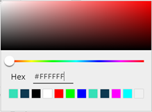
We can choose colour easily from the colour picker, for specific colour we can add Hex code.
| To set Transparent at any place use #0000 as a Hex value. |
It has categorised in sections below:
Color
This section is further divided into sub-section for targeting specific part of application for setting colour.
i. Primary color
The primary color is the main color of your style and is used for buttons and other interactive elements.
ii. Secondary color
The secondary color is used for the sliding part of the Switch component as well as the track color for the Switch and Slider components.
iii. Background color
This is the default background color used for views.
iv. Secondary background color
This is an alternate background color used for views.
v. Supporting color
The first supporting color is used for the background of an item in the Flat List component, text color of the unselected option in the dataset sorting buttons as well as the maximum track color of the Slider component. The second supporting color is used as the background color for the unselected option in the dataset sorting buttons.
Top Bar
Style settings related to Top Bar under this section.
i. Color, this color will be used for Top bar inside the Application.
ii. Enable gradient, if we enable gradient, we get option to choose the second color for gradient.
iii. Backgroundimage, we can selectimage for setting as a background of Top Bar. It has option to set the size of theimage for background. (Cover, Contain, Stretch, Repeat & Center)
iv. Drawer button, this section contains the style setting for the Top Bar Drawer button. Following properties are available to set.
Drawer button fill & background color properties
Button Icon
Color
Background color
Border width & color
Left width
Left color
Right width
Right color
Top width
Top color
Bottom width
Bottom color
Border style
Solid/Dotted/Dashed
Border Corner Radius
Top Left
Top Right
Bottom Left
Bottom Right
 *v. Back button*, this section contains the style setting for the Top
Bar back button. Following properties are available to set.
Back button fill & background color properties
Button Icon
Color
Background color
Border width & color
Left width
Left color
Right width
Right color
Top width
Top color
Bottom width
Bottom color
Border style
Solid/Dotted/Dashed
Border Corner Radius
Top Left
Top Right
Bottom Left
Bottom Right
 *vi.* *Previous button*, this section contains the style setting for
the Top Bar Previous button. Following properties are available to set.
Previous button fill & background color properties
Button Icon
Color
Background color
Border width & color
Left width
Left color
Right width
Right color
Top width
Top color
Bottom width
Bottom color
Border style
Solid/Dotted/Dashed
Border Corner Radius
Top Left
Top Right
Bottom Left
Bottom Right
 *vii. Next button,* this section contains the style setting for the Top
Bar Next button. Following properties are available to set.
Next button fill & background color properties
Button Icon
Color
Background color
Border width & color
Left width
Left color
Right width
Right color
Top width
Top color
Bottom width
Bottom color
Border style
Solid/Dotted/Dashed
Border Corner Radius
Top Left
Top Right
Bottom Left
Bottom Right
-
viii. Sort button*, this section contains the style setting for the Top Bar Sort button. Following properties are available to set.
Sort button fill & background color properties
Button Icon
Color
Background color
Border width & color
Left width
Left color
Right width
Right color
Top width
Top color
Bottom width
Bottom color
Border style
Solid/Dotted/Dashed
Border Corner Radius
Top Left
Top Right
Bottom Left
Bottom Right
 *ix. Context button*, this section contains the style setting for the
Top Bar Context button. Following properties are available to set.
Context button fill & background color properties
Button Icon
Color
Background color
Border width & color
Left width
Left color
Right width
Right color
Top width
Top color
Bottom width
Bottom color
Border style
Solid/Dotted/Dashed
Border Corner Radius
Top Left
Top Right
Bottom Left
Bottom Right
 *x. Add button*, this section contains the style setting for the Top
Bar Add button. Following properties are available to set.
Add button fill & background color properties
Button Icon
Color
Background color
Border width & color
Left width
Left color
Right width
Right color
Top width
Top color
Bottom width
Bottom color
Border style
Solid/Dotted/Dashed
Border Corner Radius
Top Left
Top Right
Bottom Left
Bottom Right
 *xi. Carousel default indicator,* The dot indicator default settings
for Top bar carousel. Following properties are available to set.
Border properties
Width
Style
Color
Background
Color
Opacity
*xii. Carousel selected indicator*
The dot indicator selected settings for Top bar carousel. Following properties are available to set.
Border properties
Width
Style
Color
Background
Color
Opacity
Menu
For menu we have below properties to set in style:
Menu Background
Color
Enable Gradient
Color 2
Menu Selected Background
Color
Menu Backgroundimage
Image
Size (Cover, Contain, Stretch, Repeat & Center)
Sub Menu
Sub menu Background and Border
Background
Color
Enable Gradient
Color 2
Backgroundimage
Image
Size (Cover, Contain, Stretch, Repeat & Center)
Padding
Top – Right – Bottom – Left
Border Width and Color
Left Color
Left Width
Right Color
Right Width
Top Color
Top Width
Bottom Color
Bottom Width
Border Style – (Solid/Dotted/Dashed)
Border corner radius
Top Left
Top Right
Bottom Left
Bottom Right
Submenu button default settings
Background
Color
Flex settings
Flex direction
Justify content
Align items
Padding
Top
Right
Bottom
Left
Border Width and color
Left Color
Left Width
Right Color
Right Width
Top Color
Top Width
Bottom Color
Bottom Width
Border Style – (Solid/Dotted/Dashed)
Border corner radius
Top Left
Top Right
Bottom Left
Bottom Right
-
*
Submenu button selected settings
Background
Color
Flex settings
Flex direction
Justify content
Align items
Padding
Top
Right
Bottom
Left
Border Width and color
Left Color
Left Width
Right Color
Right Width
Top Color
Top Width
Bottom Color
Bottom Width
Border Style – (Solid/Dotted/Dashed)
Border corner radius
Top Left
Top Right
Bottom Left
Bottom Right
-
*
Submenu button text default settings
Text Font properties
Font Family
Font color
Font size
Font weight
(Normal / Bold)
Font Style
(Normal / Italic)
Text decoration
(Underline/Line through/Under line through)
Text transformation
(Uppercase/Lowercase/Capitalize)
Shadow properties
Color
Radius
Letter spacing
Number of lines
Ellipsize mode
Flex settings
Flex direction
Justify content
Align items
Text padding
Top
Right
Bottom
Left
Border color and width
Left color
Left width
Right color
Right width
Top color
Top width
Bottom color
Bottom width
Border Style
(Solid / Dotted / Dashed)
Border corner radius
Top Left
Top Right
Bottom Left
Bottom Right
-
*
Submenu button text selected settings
Text Font properties
Font Family
Font color
Font size
Font weight
(Normal / Bold)
Font Style
(Normal / Italic)
Text decoration
(Underline/Line through/Under line through)
Text transformation
(Uppercase/Lowercase/Capitalize)
Shadow properties
Color
Radius
Letter spacing
Number of lines
Ellipsize mode
Flex settings
Flex direction
Justify content
Align items
Text padding
Top
Right
Bottom
Left
Border color and width
Left color
Left width
Right color
Right width
Top color
Top width
Bottom color
Bottom width
Border Style
(Solid / Dotted / Dashed)
Border corner radius
Top Left
Top Right
Bottom Left
Bottom Right
Tab Bar
Tab Bar Background and Border
Background
Color
Enable Gradient
Color 2
Backgroundimage
Image
Size (Cover, Contain, Stretch, Repeat & Center)
Padding
Top – Right – Bottom – Left
Border Width and Color
Left Color
Left Width
Right Color
Right Width
Top Color
Top Width
Bottom Color
Bottom Width
Border Style – (Solid/Dotted/Dashed)
Border corner radius
Top Left
Top Right
Bottom Left
Bottom Right
Tab button default settings
Background
Color
Flex settings
Flex direction
Justify content
Align items
Padding
Top
Right
Bottom
Left
Border Width and color
Left Color
Left Width
Right Color
Right Width
Top Color
Top Width
Bottom Color
Bottom Width
Border Style – (Solid/Dotted/Dashed)
Border corner radius
Top Left
Top Right
Bottom Left
Bottom Right
-
*
Tab button selected settings
Background
Color
Flex settings
Flex direction
Justify content
Align items
Padding
Top
Right
Bottom
Left
Border Width and color
Left Color
Left Width
Right Color
Right Width
Top Color
Top Width
Bottom Color
Bottom Width
Border Style – (Solid/Dotted/Dashed)
Border corner radius
Top Left
Top Right
Bottom Left
Bottom Right
-
*
Tab button text default settings
Text Font properties
Font Family
Font color
Font size
Font weight
(Normal / Bold)
Font Style
(Normal / Italic)
Text decoration
(Underline/Line through/Under line through)
Text transformation
(Uppercase/Lowercase/Capitalize)
Shadow properties
Color
Radius
Letter spacing
Number of lines
Ellipsize mode
Flex settings
Flex direction
Justify content
Align items
Text padding
Top
Right
Bottom
Left
Border color and width
Left color
Left width
Right color
Right width
Top color
Top width
Bottom color
Bottom width
Border Style
(Solid / Dotted / Dashed)
Border corner radius
Top Left
Top Right
Bottom Left
Bottom Right
Tab button text selected settings
Text Font properties
Font Family
Font color
Font size
Font weight
(Normal / Bold)
Font Style
(Normal / Italic)
Text decoration
(Underline/Line through/Under line through)
Text transformation
(Uppercase/Lowercase/Capitalize)
Shadow properties
Color
Radius
Letter spacing
Number of lines
Ellipsize mode
Flex settings
Flex direction
Justify content
Align items
Text padding
Top
Right
Bottom
Left
Border color and width
Left color
Left width
Right color
Right width
Top color
Top width
Bottom color
Bottom width
Border Style
(Solid / Dotted / Dashed)
Border corner radius
Top Left
Top Right
Bottom Left
Bottom Right
Calendar
Style settings for Calendar control
Background
we can set the background color using color picker control.
Month Header font settings
Font Family |
Font Color |
Font Weight (Bold / Normal) |
Font Size |
Week Header font settings
Font Family |
Font Color |
Font Weight (Bold / Normal) |
Font Size |
Day font settings
Font Family |
Font Color |
Font Weight (Bold / Normal) |
Font Size |
Today settings
Text Color |
Selected Day settings
Text Color |
Day Background color |
Enable Day settings
Text Color |
Disable Day settings
Text Color |
Month Next icon settings
Icon |
Icon color |
Month Previous icon settings
Icon |
Icon color |
Text
We can set style for Text in below different sections:
Headers
Text Font properties
Font Family
Font color
Font size
Font weight
(Normal / Bold)
Font Style
(Normal / Italic)
Text decoration
(Underline/Line through/Under line through)
Text transformation
(Uppercase/Lowercase/Capitalize)
Shadow properties
Color
Radius
Letter spacing
Number of lines
Ellipsize mode
Menu
Text Font properties
Font Family
Font color
Font size
Font weight
(Normal / Bold)
Font Style
(Normal / Italic)
Text decoration
(Underline/Line through/Under line through)
Text transformation
(Uppercase/Lowercase/Capitalize)
Shadow properties
Color
Radius
Letter spacing
Number of lines
Ellipsize mode
Body
Text Font properties
Font Family
Font color
Font size
Font weight
(Normal / Bold)
Font Style
(Normal / Italic)
Text decoration
(Underline/Line through/Under line through)
Text transformation
(Uppercase/Lowercase/Capitalize)
Shadow properties
Color
Radius
Letter spacing
Number of lines
Ellipsize mode
Search bar
Color |
Background color |
Shape & space
Below are the properties we can set to change the look of shape & space.
Border Width and color
Left Color
Left Width
Right Color
Right Width
Top Color
Top Width
Bottom Color
Bottom Width
Border Style – (Solid/Dotted/Dashed)
Border corner radius
Top Left
Top Right
Bottom Left
Bottom Right
Padding
Top
Right
Bottom
Left